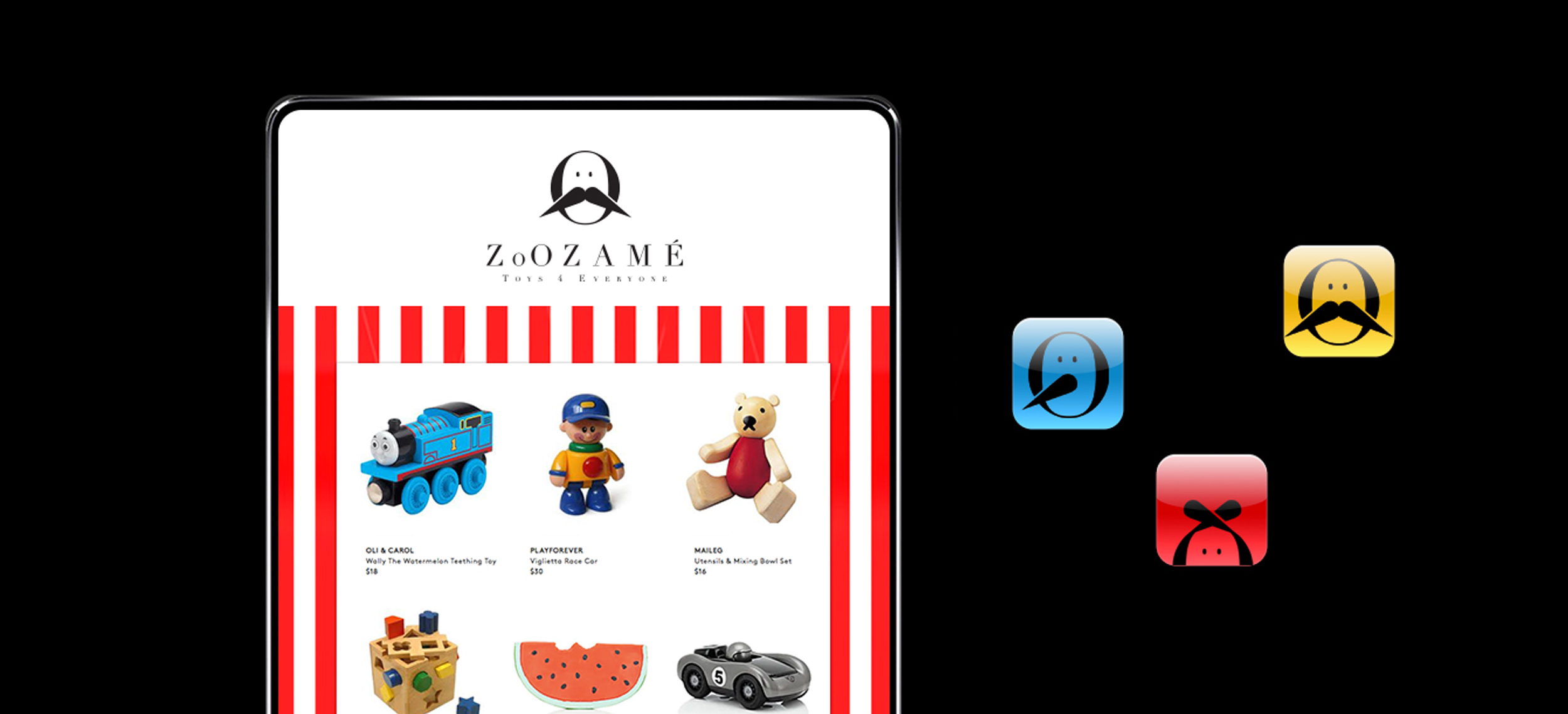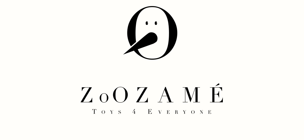
The StoryThis is zoozamé, a toy store branding design. My sister and I started a toy retail business together. Zamé actually means sisters in korean, so keeping the brand spirit true to our motivations.ChallengeI wanted to design something that appeals to both parents and children, specifically targeting luxury toy market. So, the challenge was to keep the brand identity cheerful and fun without being juvenile. Like often toy brands are too hyper and immature or just don’t resonate with the tastes of an adult. I tried to blend together simplicity and nostalgia that everyone could enjoy. A great analogy is Pixar movies.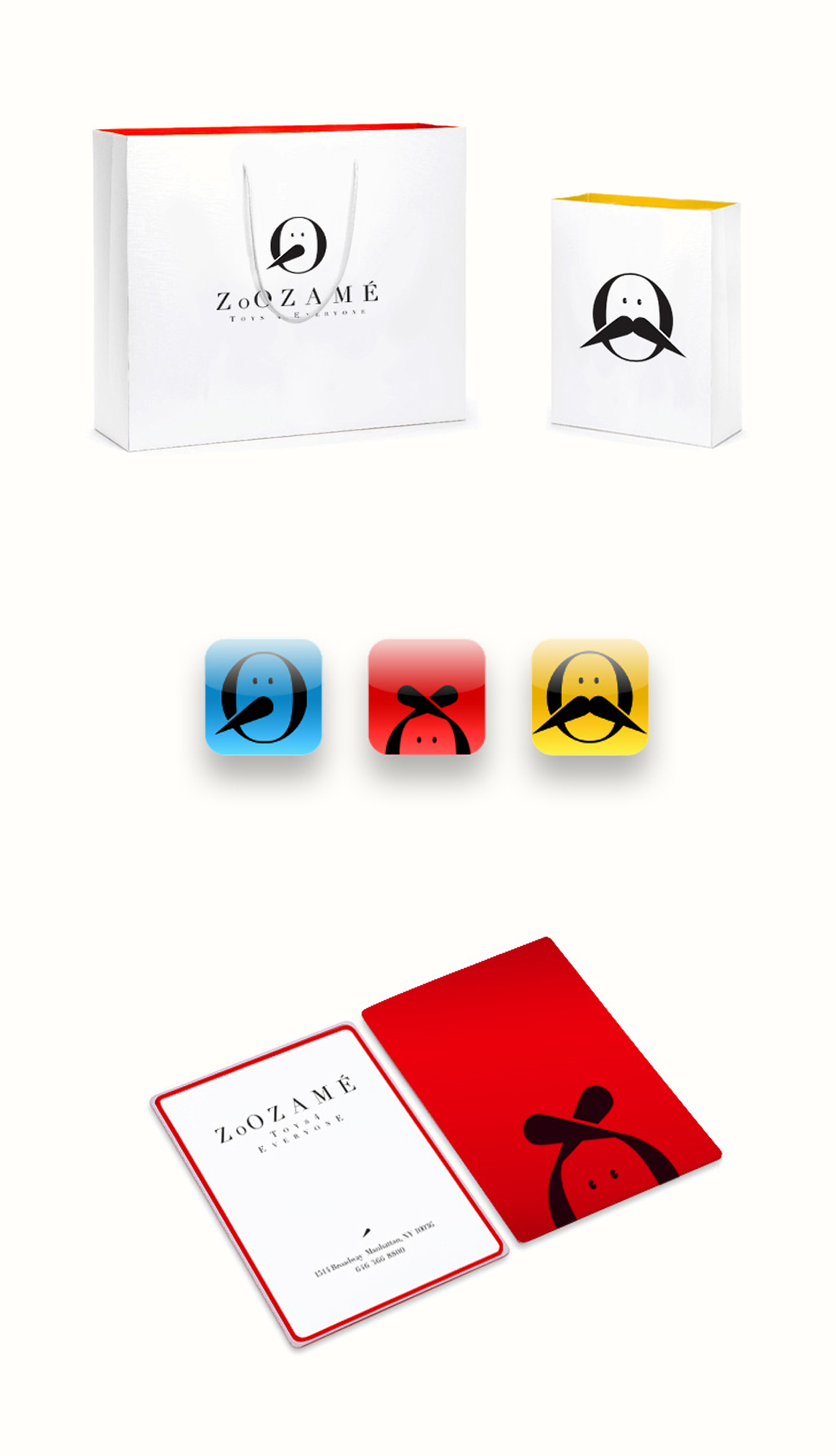 ExecutionsI was inspired by classic Disney characters like Piniocchio and Snow White. For the icons, I deconstructed the elements of those alphabet characters and distilled them to minimalist but also instantly recognizable look. I experimented with the native shapes of the didot font to keep the design language consistent throughout. So there are brightly colored details which add child-like optimism and energy, making this brand more relevant to target audience. However the design keeps a level of refinement that adults can also appreciate. |