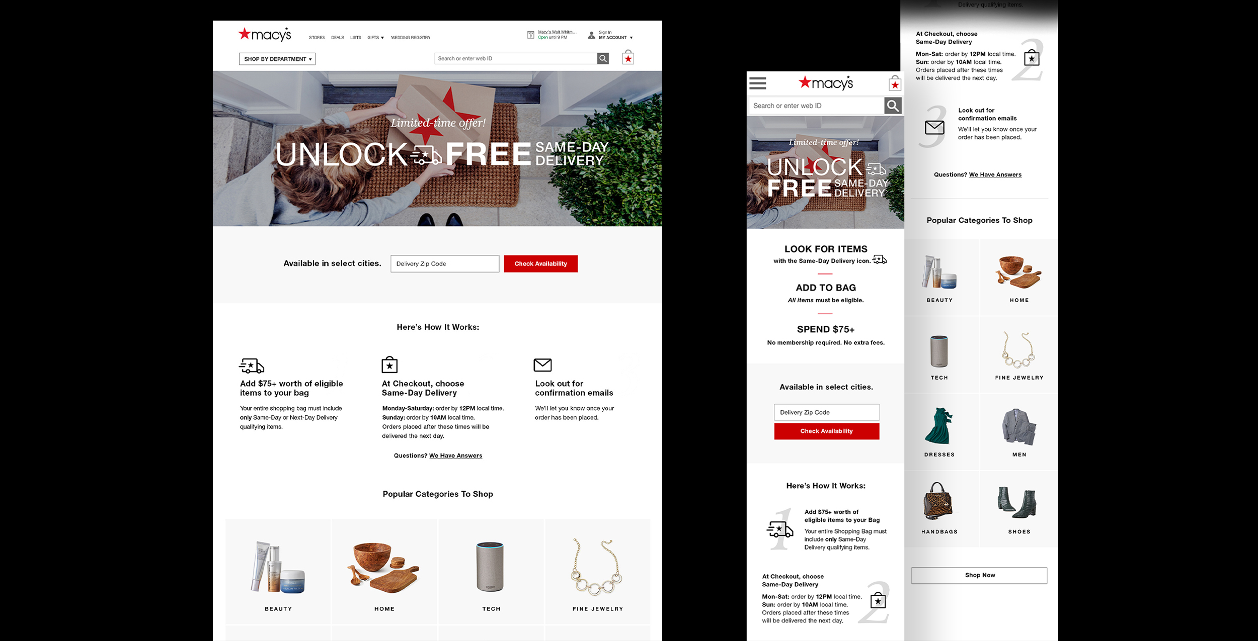
The brand experience team was asked to design the Free Same Day Delivery program, a new product test aimed to boost traffic and sales. I was the lead designer for the assets and marketing materials to execute the test.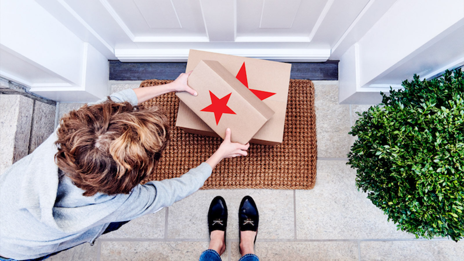 Overview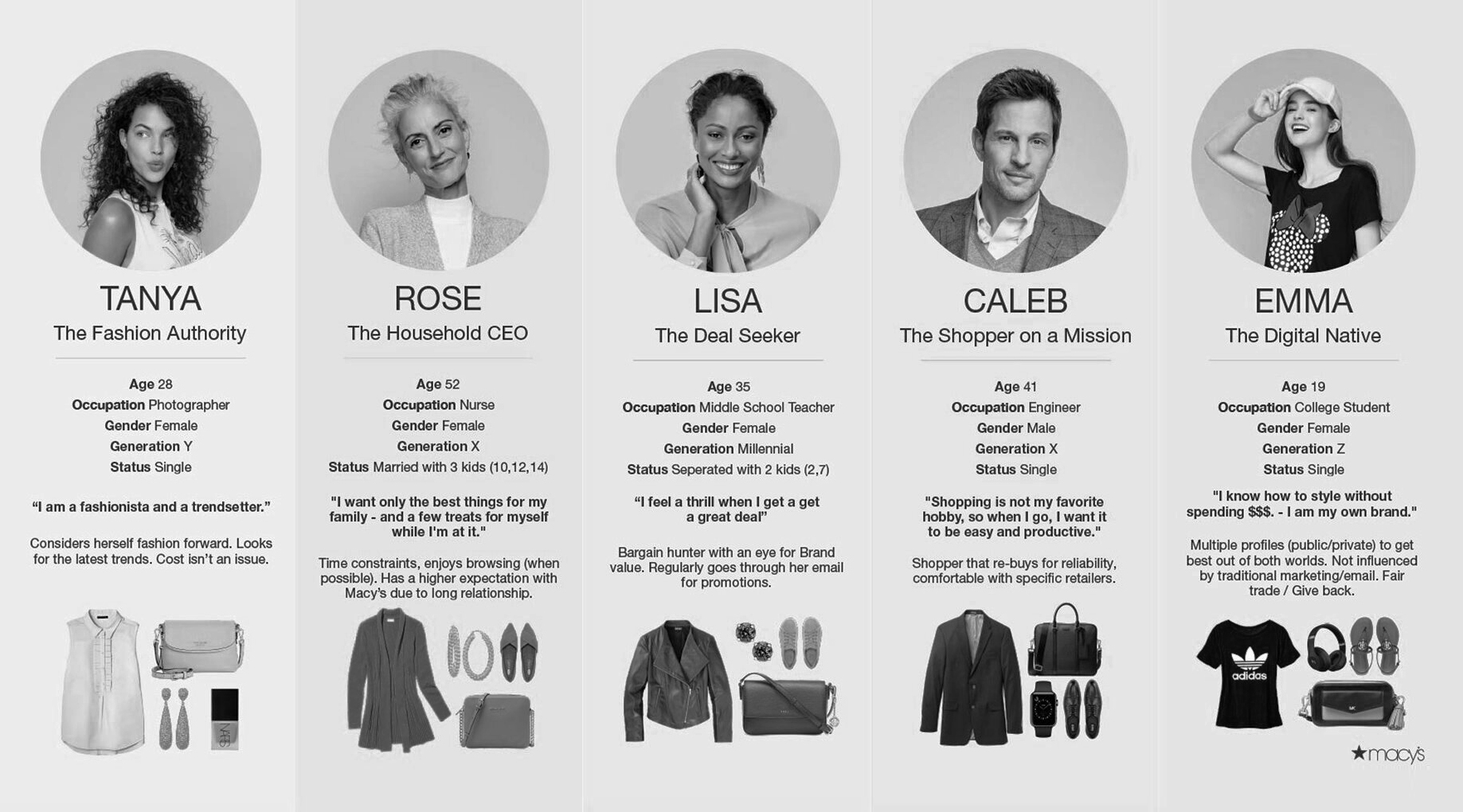 Customer Personas User Journey and Research AnalysisOur team partnered with the customer-centric design research team to gather information about potential users. These personas are based on customer feedback and interviews. Emma - The Digital Native and Tanya - The Fashion Authority were two key personas in the user group.Design processAs the landing page structure was simple and not the main part of this program, I wanted to focus on determining the most appropriate visual symbol. In selecting iconography, candidates included packages and clocks. Ultimately, we choose a delivery truck with trailing lines, indicating speed. Additionally, the truck was the only real-world object that could accurately depict movement.Icon options for same day delivery 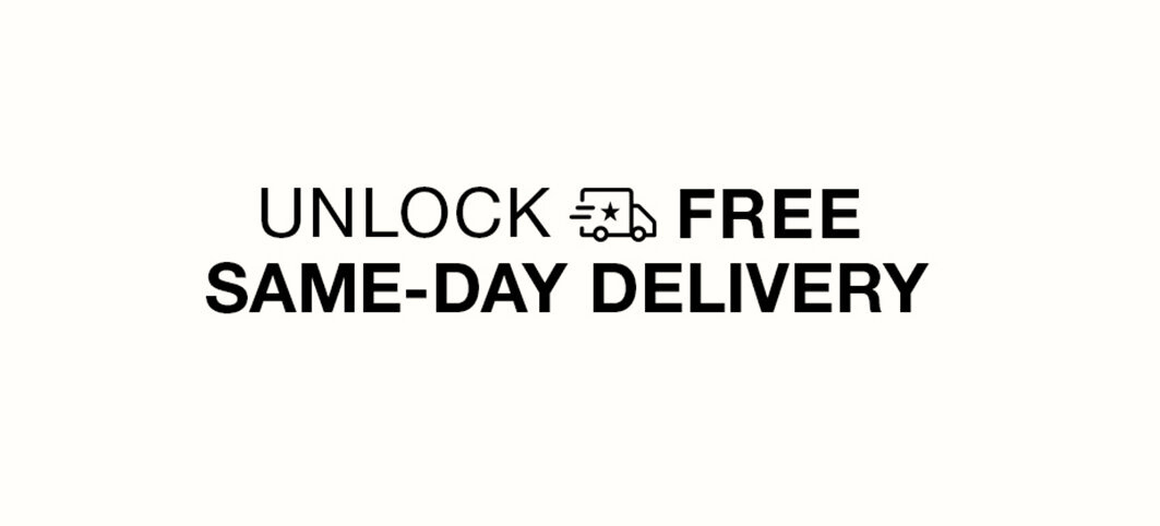 I added the truck icon seamlessly into the typography to create lock-up and promoted the word FREE by emphasizing in bold for hierarchy. DeliverablesSuccessfully delivering email campaigns, banners, and landing pages that connect with customers’ shopping behaviors and effectively communicate through a simple visual language was a challenging but highly rewarding achievement.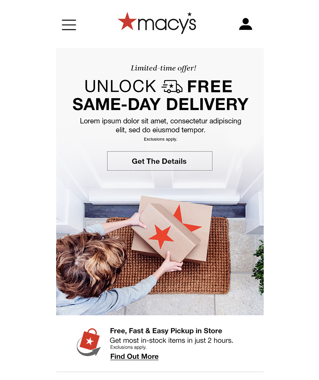 |