| Team: Global Product Designer(myself), UX research, and Design Director My Responsibilities: Research & Testing Data Analysis, Responsive Design, Prototype Duration: 6+ months The problemThe right hand fly-out function of the Shop All feature within Clinique’s navigation system is the most underutilized button and causes the customer friction when attempting to navigate Clinique’s website. It also needed updates on taxonomy, reorganize of popular manu for better serve of customers needs. |

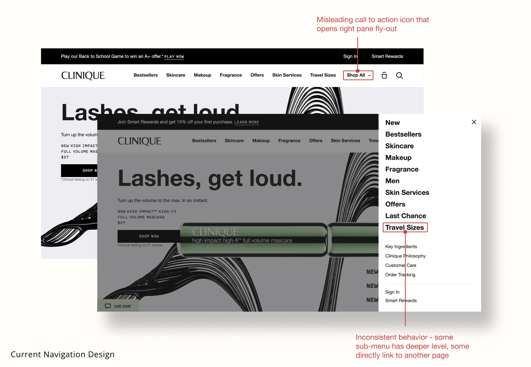
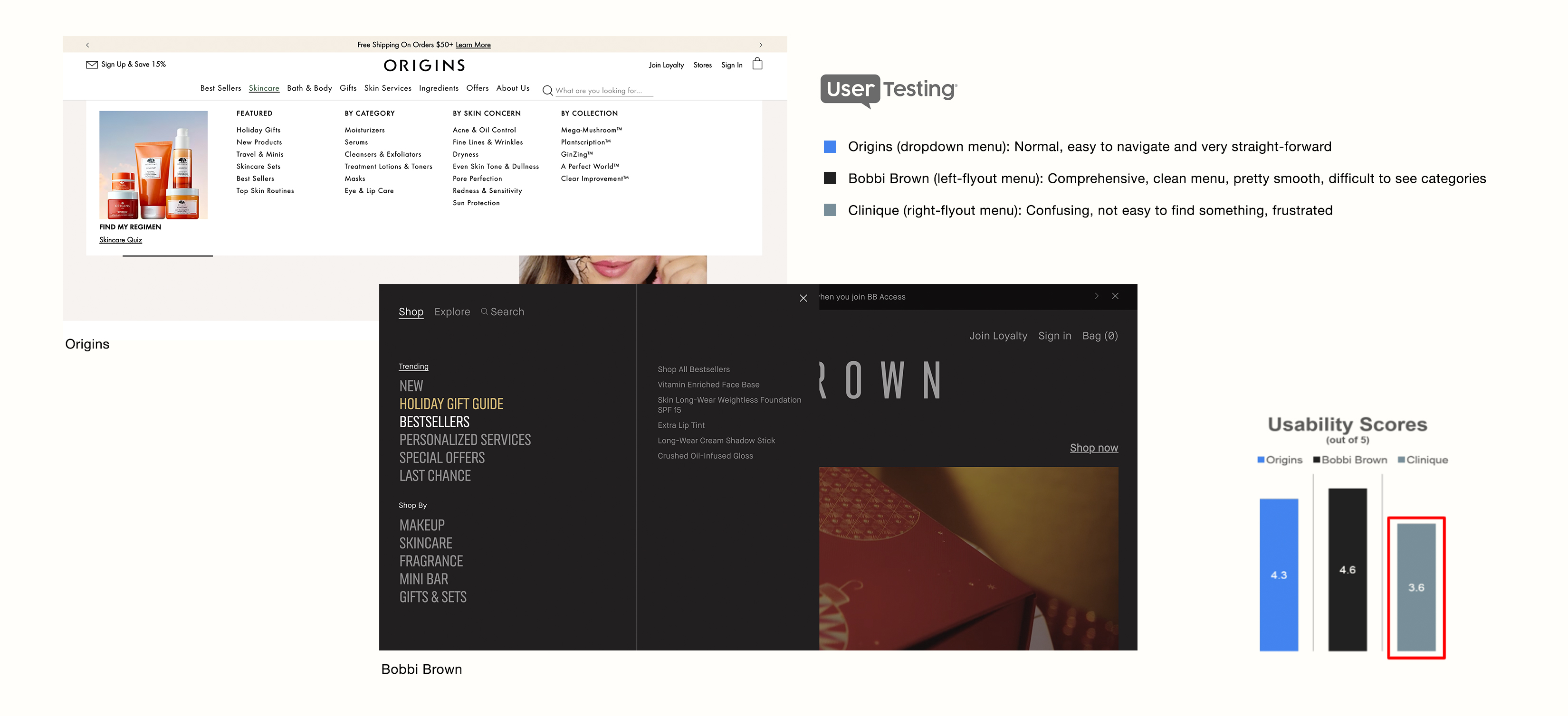
Research & DiscoveryBaymard Institute* Recommendation Based on 2021 Clinique Audit Report Clinique’s navigation usability scored poor because of it’s novel navigation (fly-out style) that could introduce sever friction. It should be easy to navigate with familiar and best UX practice which has dropdown hover options. *Baymard institue is an independent web usability research institute. Their research is based on 110,000 hours of UX research and is distilled into over 580 design guidelines and 77,800 UX performance scores. Qualitative User Testing Our internal UX research team conducted user testing with 5 participants to understand preferred top-level navigation design. The task involved comparing the ease of use and other sentiments from Origins’ traditional drop-down menu, Bobbi Brown’s left side fly-out menu and Clinique’s navigation menu while navigating specific products. 4/5 users stated ‘very easy’ to navigate from Origins website. Users disliked that Clinique has limited visibility on categories and complex interaction caused by right pane fly-out that is disorienting and less intuitive. |
| Quantitative User Testing Clinique has asked Contentsquare, a digital experience analytics platform, to conduct a navigation analysis. By harnessing metrics such as click rate (only 2% on shop all), conversion rate (men and offers were surprisingly the top - about 30%), and visitor data insights, that there’s opportunity to enhance the visibility of categories and facilitate a more seamless browsing experience through the catalog. It predicts US will see a lift of +$2mil/year with optimized new design. A/B testing & Conclusion While researching and other UX efforts were going on, we still wanted to see if our hypothetical idea wins in actual test. I designed the horizontal dropdown nav as a variant and testing team conducted A/B test. |
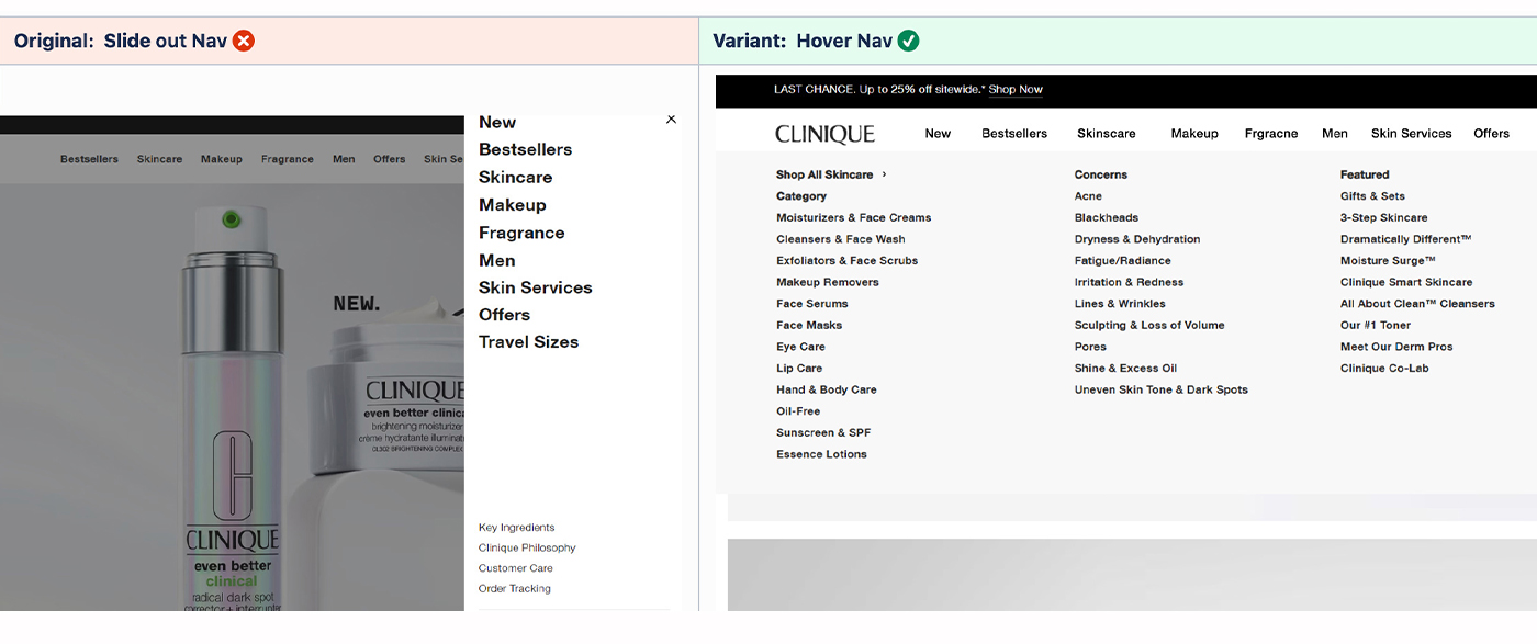
The winner is Variant(Hover Dropdown Nav). Primary materic was to see changes in click rate(top & sub level), it showed declines in parent nav item clicks, but increases to product landing page visits suggest user getting deeper in the journey faster.
Significant increase(+420.89%) to sub nav item clicks and significant declines(-12.70%) in searches supports theory that users finding products easier using hover nav.Design & DevelopmentI studied more than 10 competitor's menu design and started sketching wireframes. As global navigation was crucial area of the homepage, update was not only focused on orientation but also optimization and utilization. With too much text and category to process, images helps users to have break from cognitive overload. |
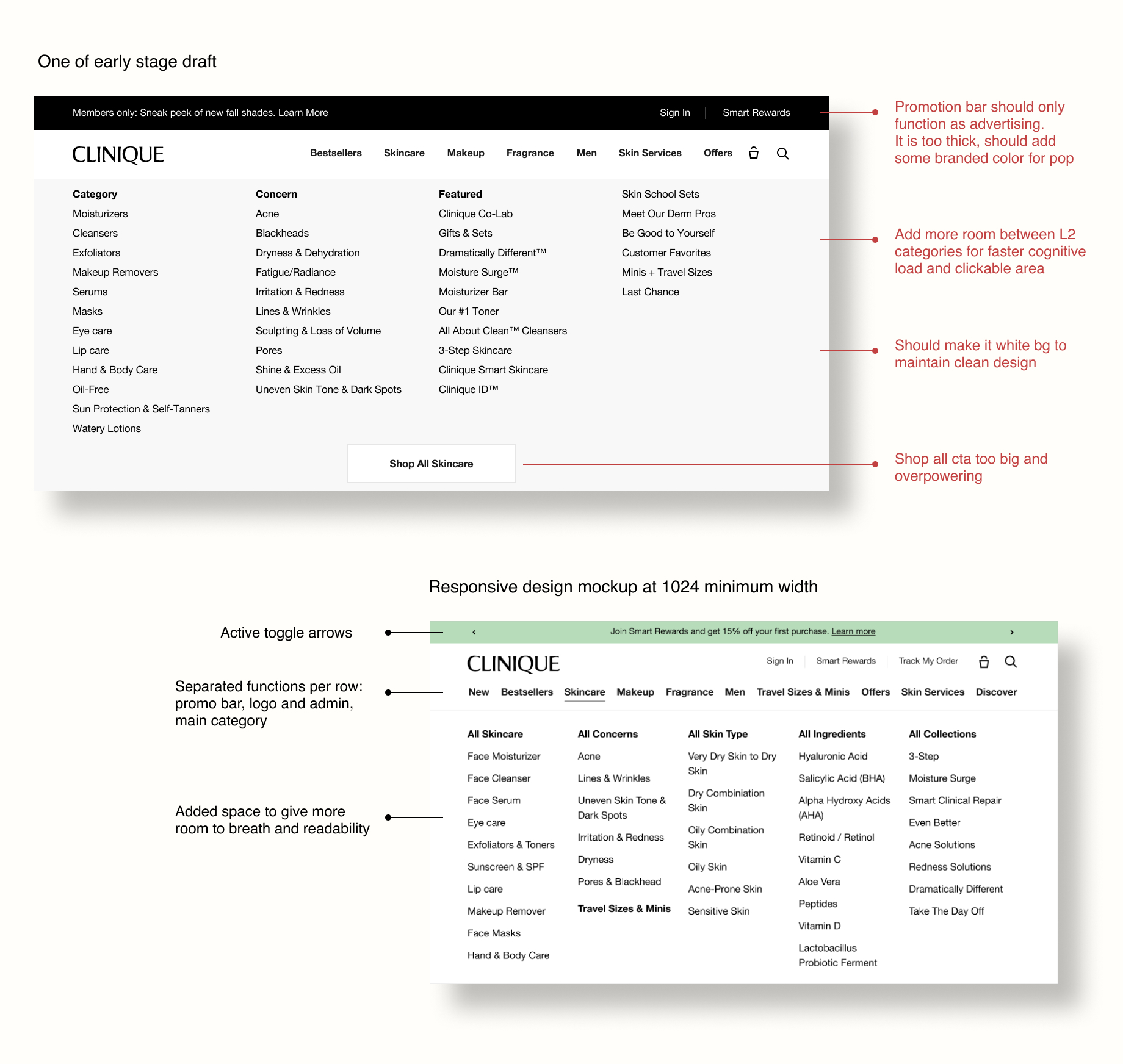
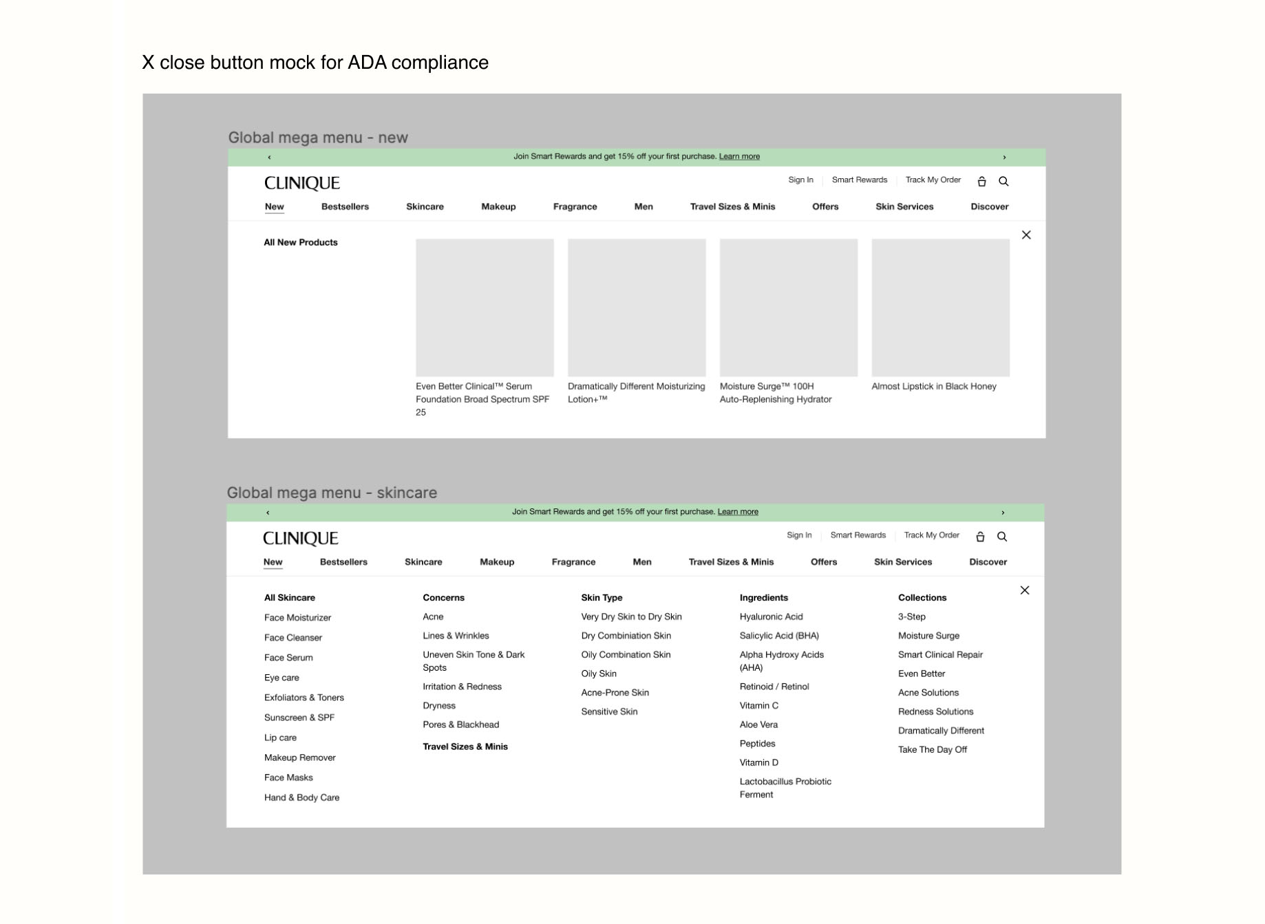
| Adding product/campaign images as bestsellers and promotional banner were designed to satisfy both company marketing perspective as well as customer's experience. To meet ADA standard, I made sure there's enough clickable area for each devices(desktop - 24px and mobile - 44px). |
| Responsive Design I referenced Tailwind framework for breakpoint after discussion with dev team and used figma plugin to showcase realistic experience. |
|
Delivery After design is approved by the stakeholders such as brand strategy, PMs and Global UX/UI team, I worked with engineers to clear the expectation. It includes communication about design, function, interaction and responsiveness. Soft LaunchOnce the test dev site is ready, I do QAs and make annotation figma file by creating side by side comparison to help refine the live product. Most of times QA team ask questions around designs and Dev team with functionality. It launched in North America November 2023 and will roll out to other regions such as APAC and EMEA after. |
|
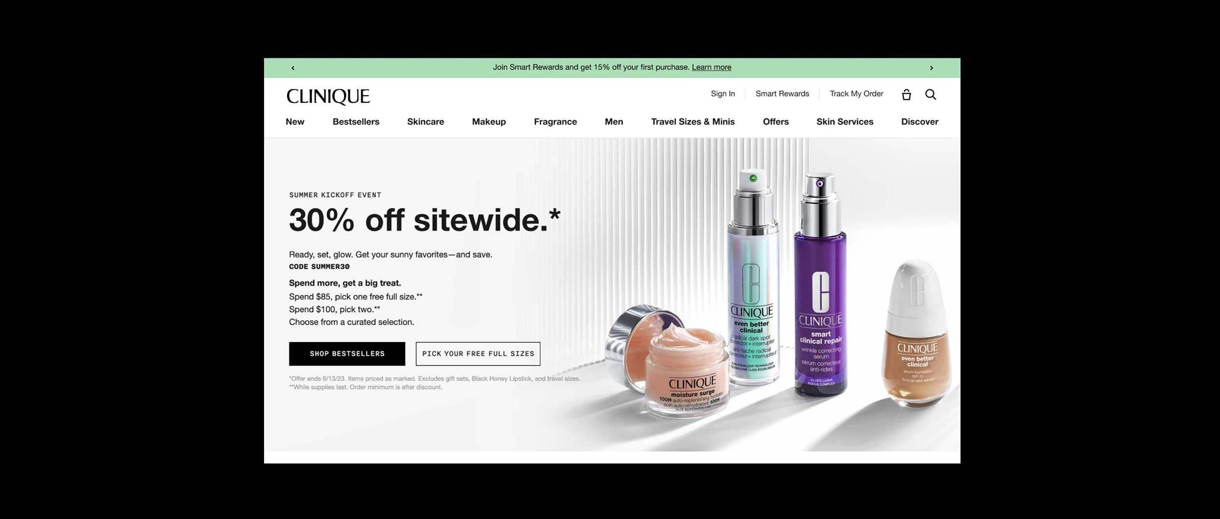
Live site: Clinique Homepage My expreienceThe global navigation redesign project started a year ago and I learned how one project involves so many people and efforts. One of the challenge was to effectively display overwhelming amount of menu items at a glance. I was lucky to have other brand designers who worked on similar project and shared their learnings. By using card sorting exercise with customers and reduced number of menus from brand marketing and strategy, I achieved streamlined navigation.Thorough process of studying all the problems and future possible solve by researching and testing takes time. Designing something that fits brand and also improves user experience based on the firm idea and structure earned me confidence. Also, final product is always the star of the show but crews at the behind a stage matters as much as the star. |